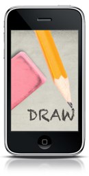
 Erica Sadun recently released her latest app, Draw (iTunes link), into the wilds of the App Store. I take a special interest in this release because I designed the interface for it from the ground up. Erica, of course, made all of the magic happen; she’d take my photoshop sketches and send them back as amazing working interfaces. In the end, it was a really fun process to go through and Erica was great to work with. Here’s a quick walk-through of the design process.
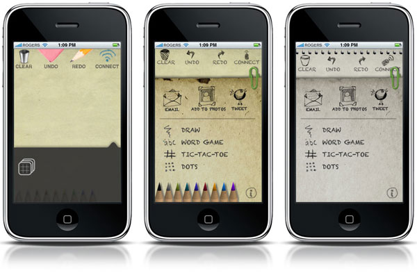
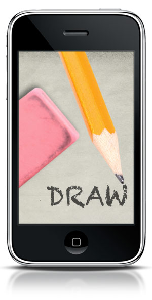
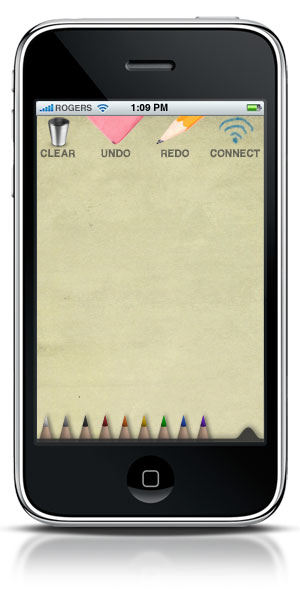
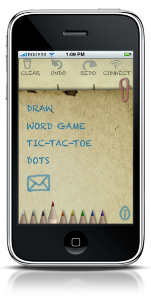
I started with a choice between a chalkboard motif and something more pencil-and-paper based. Erica made that decision pretty easy, and we moved forward with a “sketchbook” look. The pencil picker was an interesting challenge, I needed to make them small and compact and Erica needed to make them, um, work. A little back and forth and she had a working model using my tiny little pencils that even the largest-fingered user would be able to use.
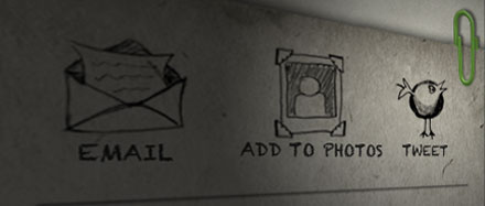
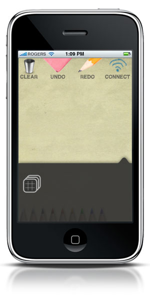
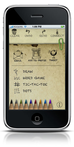
At first, I was mixing hand drawn elements and photorealistic icons, which I ditched in favor of a more congruous hand-drawn aesthetic overall. This included redesigning the more traditional “HUD” slider to be a piece of paper as well. The nub of translucent black originally used to pull the HUD up turned into a paperclip, attached to a slightly discolored piece of paper which slid over the main panel to reveal additional options. Whereas the HUD would have been suited by a typical exponential tween, the paper aesthetic required a little more cartoonish animation, which Erica accomplished adeptly with a nice bounce.
The icons went through quite a few permutations before I gave up on finding the right brush in Illustrator. Eventually, I drew the icon elements (on the same sketchpad I scanned to make the final paper textures) and scanned them in, cleaned them up and turned them into icons. As the sliding elements and icons became less “modern,” the paper textures and hand-drawn elements became less “antique,” and soon they met in the middle in a more harmonic interface.
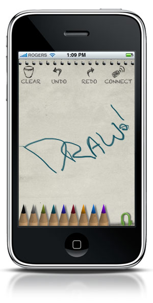
The color changed over the course of the mockups, eventually ending up on a more neutral blue-grey. It looks dull and dead next to the more “antiqued” previous generations, but it’s much easier to create your own drawings on a neutral page, so I decided to keep things grey. I think it works well for the end user.
The best part of working with Erica is that she could make any of my little visual ideas “work.” In programming my own apps, I often pull some punches because I don’t have the chops to pull them off quickly. It makes a big difference working with someone who knows the iPhone SDK inside and out. I think the finished 1.0 version of Draw is a slick, easy-to-use app that will be fun for all ages.