App Review: Gradient
Gradient is a very polished tool for creating CSS3 gradients in a visual way. If you’re not familiar with CSS3 syntax, it looks a little like this:
background-color: #000106;
background-image: -webkit-gradient(radial, 50% 100%,100,50% -50%,100, to(rgba(41, 63, 125, 1.00)), from(rgba(0, 1, 6, 1.00)));
background-image: -webkit-radial-gradient(50% 0%, rgba(41, 63, 125, 1.00), rgba(0, 1, 6, 1.00));
background-image: -moz-radial-gradient(50% 0%, rgba(41, 63, 125, 1.00), rgba(0, 1, 6, 1.00));
background-image: -o-radial-gradient(50% 0%, rgba(41, 63, 125, 1.00), rgba(0, 1, 6, 1.00));
background-image: -ms-radial-gradient(50% 0%, rgba(41, 63, 125, 1.00), rgba(0, 1, 6, 1.00));
background-image: radial-gradient(50% 0%, rgba(41, 63, 125, 1.00), rgba(0, 1, 6, 1.00));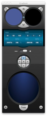 In order to make your gradients show up in as many browsers as possible, that’s what you need to do. It’s kind of a pain no matter how you look at it.
Gradient, on the other hand, makes it a breeze. You select start and stop colors using the standard Apple color picker or by manually inputing values. You choose linear or radial gradient with a slider, and then tweak direction and point of origin with a grid of buttons. You can choose which browsers you want to support, then just hit the “Copy” button and your code is in your clipboard. Simple, effective and it looks great.
Gradient can run in menubar only mode (hide the Dock icon), which has the added benefit of being able to pop up while in a Lion fullscreen mode without switching spaces.
The only current downside to Gradient, in my opinion, is that you can only have two colors and you can’t tweak the stops for complex gradient effects. For 90% of the gradients I would use, though, Gradient solves the problem brilliantly.
Gradient is currently free in public beta, so grab a copy to play with before the final release.

Brett is a writer and developer living in Minnesota, USA. You can follow him as ttscoff on Twitter, GitHub, and Mastodon. Sign up for the email newsletter, and keep up with this blog by adding it to your favorite news reader.